10 Best Looker Studio Dashboard Templates for 2026

Stop wasting hours on dashboard design. If you've ever glued GA4, Search Console, ad platforms, and CRM exports into one report, you already know the pain. The numbers are there, but the story isn't. Stakeholders want answers fast, and a messy dashboard makes even good performance look suspicious.
Looker Studio dashboard templates solve that problem when they're chosen well. The best ones don't just look polished, they give you a structure for KPI mapping, a clean import path, and a faster route from raw data to decisions. That matters because template ecosystems now cover paid ads, SEO, ecommerce, and CRM or email reporting, and published collections routinely show dozens of examples across those use cases, which makes template-driven reporting a normal operating habit rather than a novelty Windsor.ai's template ecosystem overview.
The trick is picking templates that match your stack instead of chasing pretty screenshots. Some are great as a baseline. Others are built for agencies, e-commerce stores, or teams that need a live cross-channel view and can't afford brittle joins or endless spreadsheet cleanup. If you need hands-on setup, customization, and attribution logic that supports growth decisions, that's where Du Marketing earns its keep.
Table of Contents
1. Looker Studio Report Gallery official
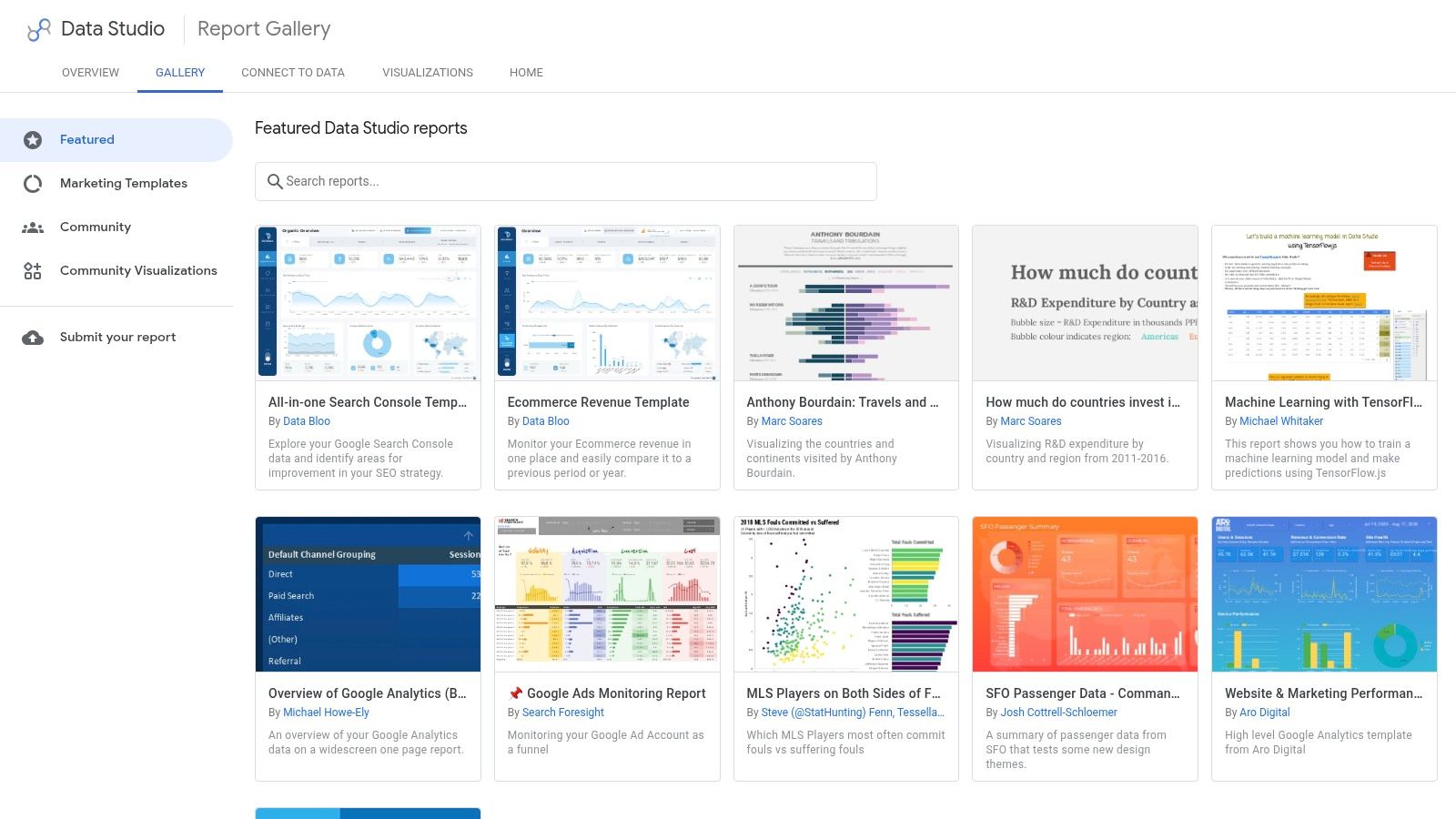
Google's official gallery is the safest place to start because it gives you a clean baseline without paying for a connector-first bundle. The Looker Studio Report Gallery is useful when you want to inspect how Google and partners structure reports before you build your own. It's also the simplest way to sanity-check a dashboard layout before you invest time in a more customized stack.
What works and what breaks
The advantage is obvious, it's free and maintained by Google. The downside is that quality and documentation vary by template, and the gallery leans heavily toward Google-native data sources. If your reporting stack includes Meta, LinkedIn, CRM, or offline revenue, expect extra work to reconcile fields and build the unified view yourself.
The gallery is best used as a structure reference, not as a final operating dashboard. I like it as a starting point for KPI placement, chart hierarchy, and navigation logic, then I map the data model afterward. That's also where a proper pipeline matters, because template design is the easy part, while data consistency is what usually slows teams down, which is why Du Marketing's data pipeline automation approach is the kind of backend work that keeps these reports usable.
Practical rule: Use the official gallery to borrow the shape of the report, not the reporting logic itself.
Import and setup notes
Start by copying a report you trust, then connect your own GA4, Search Console, or Google Ads property. After import, check every field mapping manually, because default charts often assume the source structure matches Google's sample data exactly. If you're mixing sources, define the KPI layer first, then decide which metrics belong on the landing page and which belong in drill-down pages.
Check the source mix early: Keep Google-native templates for Google-native reporting, then extend them only after you've confirmed the joins.
Rebuild the top row first: Put the main KPI at the top, because that's what stakeholders read first.
Use it as a benchmark: Compare any paid template against the gallery to see whether the paid layout is better or just prettier.
2. Data Bloo
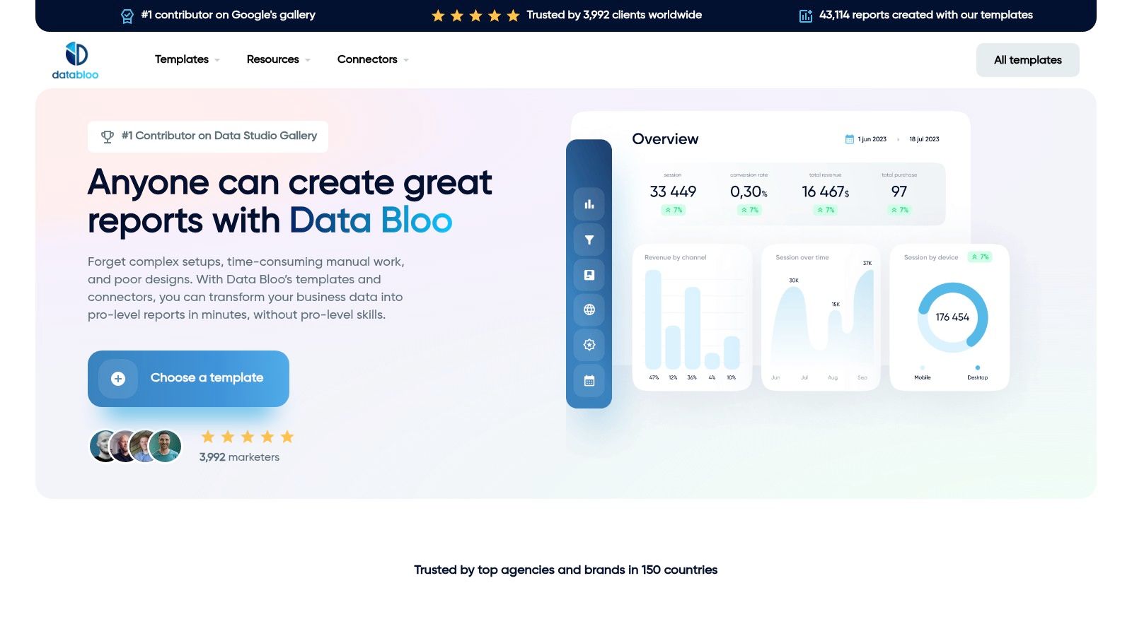
Data Bloo is the best fit when you want marketing dashboards that already feel client-ready. The bundles are built around common growth workflows, including GA4, SEO, PPC, and broader cross-channel reporting, so you're not starting from a blank page. A key advantage is speed, because the template arrives with a more opinionated reporting structure than most generic libraries.
Visit the Data Bloo website if you want polished layouts that are designed for teams who need to show performance without spending half a day moving scorecards around.
Where it fits in a real stack
Data Bloo works well for agencies and growth teams that need a dashboard to sit on top of Google Ads, Search Console, and GA4 without looking improvised. That's especially useful when a client expects a single reporting surface instead of separate channel reports. The trade-off is that paid bundles can still need tailoring if your data schema is unusual or your lifecycle metrics live in a CRM that doesn't map cleanly into the template.
The fastest way to make it useful is to import it, connect the core sources, and then prune the noise. Don't keep every chart just because it's there. If the dashboard doesn't help a stakeholder answer what changed, why it changed, and what to do next, it's too busy.
Setup and customization
Use the template's onboarding guide, then rebuild the KPI labels so they match your internal definitions. If your team tracks leads differently across sources, align that before launch. A dashboard that mixes “conversion” definitions without explanation becomes a political problem fast.
Connect the core sources first: GA4, Search Console, and ad platforms should be live before you touch styling.
Rename metrics to your language: Teams adopt dashboards faster when the labels match their weekly meeting vocabulary.
Reserve space for commentary: Add room for short notes, because context matters more than decorative charts.
3. Porter Metrics Template Gallery
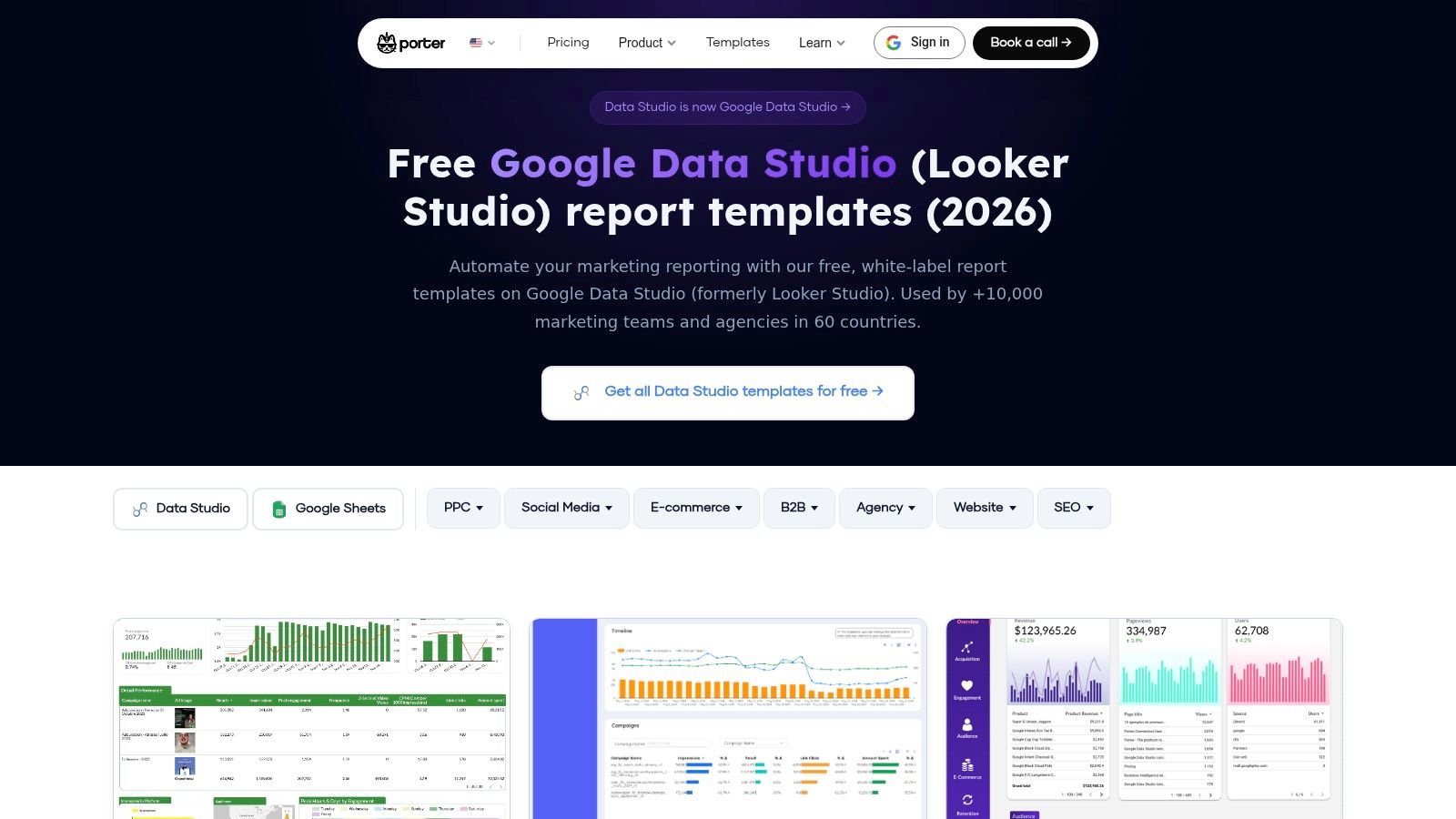
A client asks for one Looker Studio report that can cover paid, organic, ecommerce, and agency performance without turning into a messy patchwork. Porter Metrics is a solid fit for that brief. Its template gallery is organized by use case, so you can pick a PPC, social, SEO, ecommerce, or agency layout that matches the reporting job instead of forcing a generic dashboard to do everything. The template library reflects a practical marketing-ops reality, one dashboard often has to bring paid and organic data into the same view so the team can make decisions faster.
Why marketers keep coming back to it
The main strength is the setup guidance. Porter-style builds usually come with clearer copy steps and better documentation than many community templates, which cuts down the time spent guessing how fields were wired. That matters because the best dashboard is the one your team will maintain. These templates also cover the source mix many teams already use, including Google Ads, GA4, Meta or Facebook Ads, LinkedIn Ads, Microsoft or Bing Ads, Search Console, and CRM or ecommerce feeds, as shown in the broader gallery overview.
The trade-off is connector dependence. If your team already uses Porter connectors, the import process is straightforward. If not, you may spend more time mapping fields and checking source alignment than you would with a fully custom build.
If a dashboard breaks the moment a field name changes or a new channel appears, it is not a finished template, it is a temporary screenshot.
Import and KPI mapping
Start with the import, then connect the main source first and verify the primary KPI before polishing anything else. For paid media, that usually means spend, CTR, CPA, ROAS, and conversions. For SEO, start with CTR, impressions, clicks, and average position. For CRM-linked reporting, clean up lead stages and revenue fields before you try to layer attribution on top.
That order matters because bad mappings hide in pretty charts. A dashboard can look polished and still report the wrong conversion stage, wrong campaign source, or mismatched revenue total. If your team is unsure which metrics deserve the top row, use a metrics-first perspective and map the report around the decisions the dashboard needs to support.
For teams that want hands-on implementation, this is the point where Du Marketing becomes useful. If you need the template imported, custom fields checked, KPI labels rewritten to match internal definitions, and the reporting flow aligned to how leadership reviews performance, that is the work a build partner handles fast.
4. Supermetrics Template Gallery
Supermetrics is a strong pick when your reporting stack already leans on connectors or warehouse-based reporting. The template gallery is built around ready-made dashboards that work well with Supermetrics connectors or BigQuery, which is helpful if your team wants multi-source reporting without hand-building every calculated field. That warehouse-friendly angle also makes it easier to standardize recurring reporting across campaigns and properties.
What it does well
These templates are useful for teams that already think in data pipelines. You can swap in your own sources, keep the same layout, and reduce the time spent rebuilding familiar charts every month. That's especially helpful in environments where multiple marketers need the same readout but different source combinations.
The best use case is a team that wants harmonized reporting across ad platforms and GA4, especially when the underlying data already lives in a warehouse. The worst use case is a team expecting a fully finished dashboard without connector work. If you don't already have the setup, the template can feel like the front door to a larger implementation project.
Setup and customization
Import the report, confirm your connector permissions, then validate each page against the source system before sharing it. Don't assume a working chart means the field logic is correct. I've seen dashboards look fine while subtly misrepresenting period comparisons, and that's exactly the kind of problem that makes stakeholders lose trust.
Validate connector assumptions: Confirm whether the template expects Supermetrics, BigQuery, or both.
Check calculated fields carefully: ROAS, conversions, and attribution views need extra scrutiny.
Use it for standardization: If multiple team members report from the same template, lock the KPI definitions early.
5. Windsor.ai Looker Studio Template Gallery
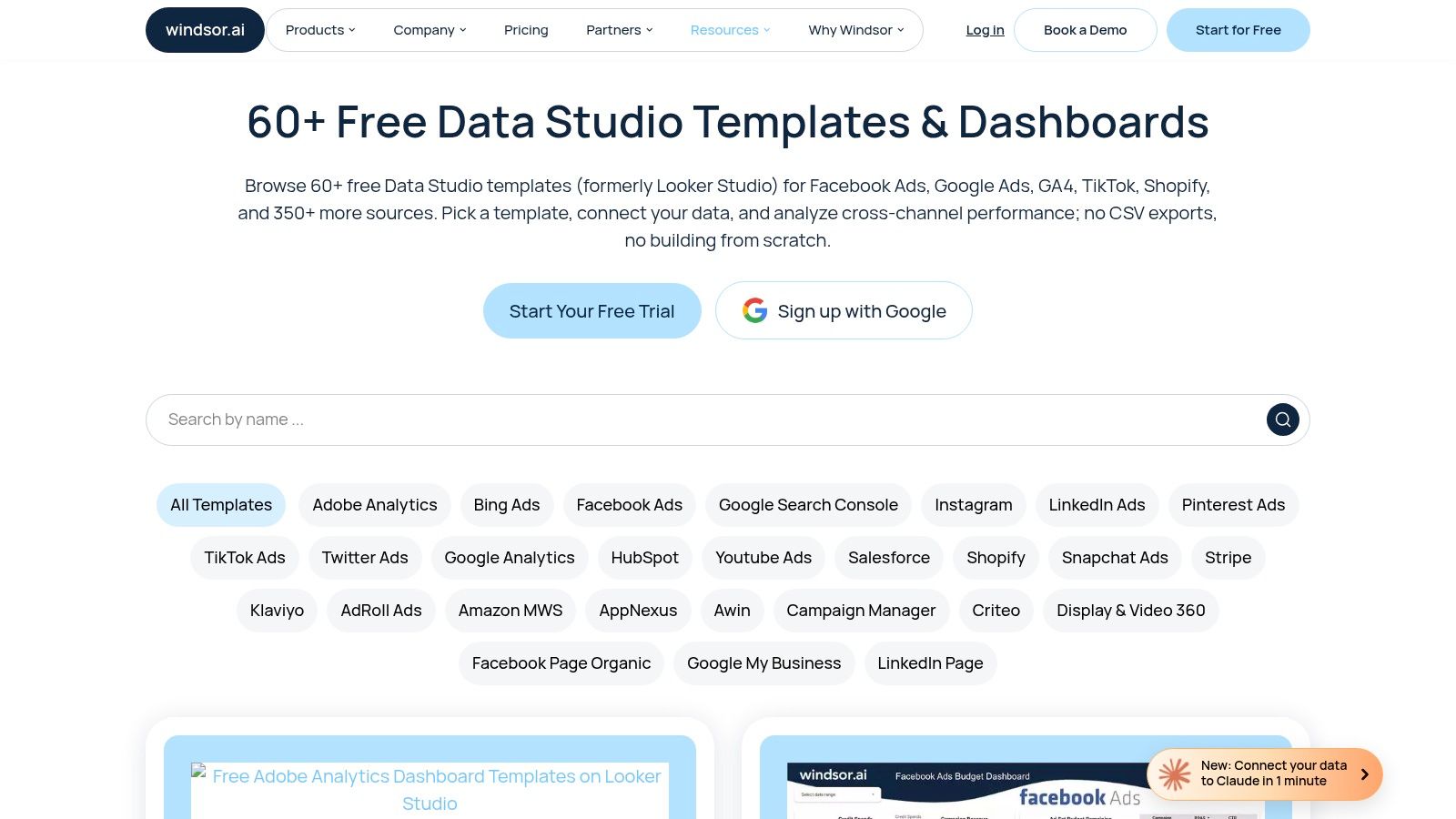
Windsor.ai gives teams a wide template set when the goal is to compare options quickly instead of building every report from scratch. The template gallery covers free Looker Studio templates for ads, analytics, and ecommerce, and it is built around Windsor connectors. That makes it a practical starting point for teams that want to test report formats before committing to a full reporting stack.
Best use case
This gallery works well for teams trying to bring Facebook Ads, Google Ads, TikTok, Shopify, and GA4 into one reporting view. The broad selection saves time during the first build, and the connector guidance reduces setup guesswork. For startup teams or lean growth teams, that usually matters more than having a perfect dashboard on day one.
There is a trade-off. Some templates are solid operating views, while others are better treated as shells that need more work. If you need CRM-based attribution or revenue reconciliation, expect to handle the heavier configuration yourself. If you need a fast comparison layer first and a polished decision system later, Windsor.ai fits that sequence well.
How to implement without chaos
Import the template, connect the correct source, and then check whether the default filters match how your team reviews performance. A dashboard can look finished and still fail in weekly meetings if the date ranges, labels, or breakdowns do not fit the way people make decisions. That is usually where trust starts slipping, not from the design itself but from small mismatches in the logic.
Start by mapping each page to a clear KPI owner. Paid media pages should answer spend efficiency and conversion volume, ecommerce pages should surface revenue and product movement, and analytics pages should keep GA4 behavior views separate from channel reporting. If the template includes calculated fields, test them against the source system before anyone relies on them.
For teams that need acquisition reporting and attribution to work together, hands-on implementation saves time later. Du Marketing's marketing reporting automation workflow is the kind of setup support that helps turn a template into something the team will keep using.
6. Power My Analytics PMA Report and Dashboard Templates
Power My Analytics is a strong fit for teams already using PMA connectors and wanting templates that align with those data pipelines. The solutions page points to ready-made Looker Studio templates for common GA4 and channel views, plus how-to guidance for editing data sources and charts. That combination is useful when your reporting team needs both a starting point and enough documentation to extend the report later.
Why it works in the real world
PMA templates are most useful when reporting is already centralized. If your team values repeatable setup and wants to keep the same data spine across multiple dashboards, PMA gives you that structure. The support library matters too, because template adoption tends to fail when the first edit is confusing and nobody wants to be the one who breaks the report.
The downside is predictable, the best experience comes with PMA subscriptions or connectors. If you're trying to avoid connector dependency, this may feel more locked-in than you want. If you're already in that ecosystem, though, the trade-off is worth it.
Implementation notes
Treat the template as a framework, not a finished deliverable. Connect the source, confirm the field names, and then edit the charts to match your internal KPI set. Keep the top line simple and leave room for drill-down pages only when the main narrative is stable.
Practical rule: A good starter dashboard reduces setup time. A good operating dashboard reduces meeting time.
7. Looker-Studio.net GA4 E-commerce Template
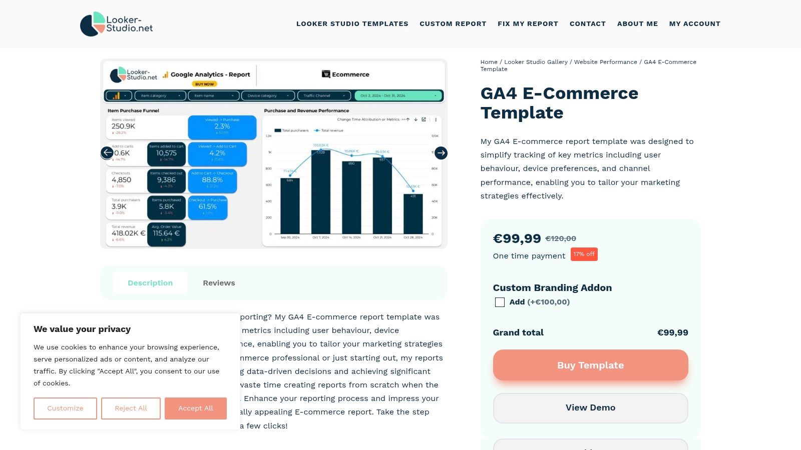
A store team does not need another generic marketing dashboard when the key question is which products sell, where checkout drops, and how revenue changes by channel. The GA4 e-commerce template from Looker-Studio.net is built for that narrower job. The GA4 e-commerce template focuses on product analytics, purchase funnels, and revenue tracking, so it fits ecommerce operators better than a broad template gallery. If ecommerce is the core business, that specialization usually pays off.
Where it earns its keep
The report is useful when you want a walkthrough-friendly e-commerce dashboard that gets to the point quickly. The implementation video helps teams that prefer a visual setup path over trial and error, especially if the person building the report is not the same person who owns the GA4 configuration. It also makes the template easier to hand off, because the first pass is less dependent on guessing which chart needs which field.
The trade-off is clear. The template assumes a standard GA4 ecommerce setup, so messy event naming or inconsistent product taxonomy will show up fast. That is not a flaw in the dashboard, it is the dashboard doing its job. Niche templates are sharper, but they are less forgiving, and this one will surface weak tracking before the team has a chance to treat the report as a source of truth.
Setup tips
Import the template first, then watch the walkthrough before touching the layout. Check that purchase and product view events are firing cleanly in GA4, because styling a report before the event map is sound only creates extra cleanup later. After that, confirm that the funnel stages match the actual event structure in your property.
Then customize the labels, category groupings, and summary cards so the report reflects how your store reviews performance. If your team checks gross revenue, AOV, and product performance in a specific order, map the dashboard to that sequence instead of forcing a generic narrative. That makes the report easier to use in weekly reviews and reduces the back-and-forth that comes from charts that look polished but answer the wrong questions.
If you need a broader reporting system that connects ecommerce data to paid media and lifecycle signals, hands-on implementation usually becomes the better call. Du Marketing's reporting automation work fits that kind of multi-source build, especially when the template is only one piece of a larger KPI stack.
8. Radyant Free GA4 Looker Studio Templates
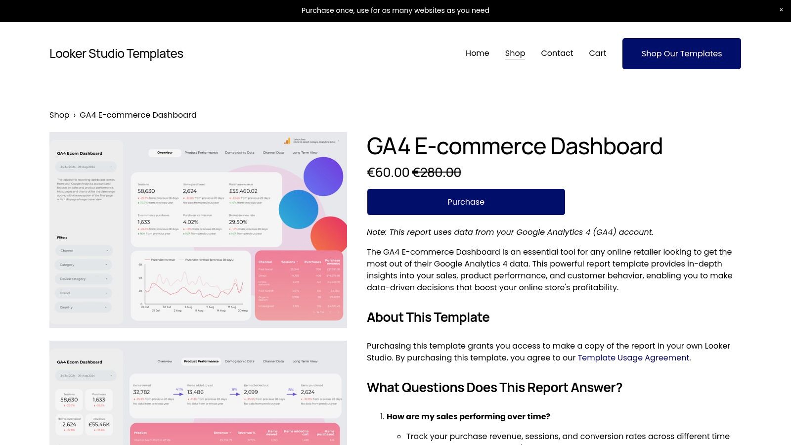
Radyant's free GA4 set is one of the better starter options for teams that need something clean, simple, and fast to deploy. The free GA4 template set includes three templates, overview, lead-gen, and ecommerce, so you can pick the format that matches the business model instead of forcing one generic layout on every team.
What makes it practical
The property switcher is the useful detail here. Multi-site teams don't want to rebuild the same GA4 report for every property, and this helps reduce repetitive setup. The templates are client-grade, straightforward, and easy to understand without a steep learning curve, which makes them good for smaller teams or early-stage startup reporting.
The limitation is just as clear, they're GA4-only. There's no built-in ad-spend blending, so if paid media is part of the weekly conversation, you'll need additional work. The styling is also minimalist, which is fine if you like clean reporting and less fine if you need heavy branding.
How to adapt it
Use it for fast deployment, then layer in your own hierarchy and visual identity. Start with the overview dashboard, because it gives you the quickest read on whether the structure fits your team. After that, branch into lead gen or ecommerce depending on the business model.
Choose the right variant first: Overview, lead-gen, and ecommerce serve different questions.
Keep branding light at first: Get the data working before polishing the visuals.
Use the property switcher deliberately: It's best when you manage several GA4 properties in a consistent way.
9. WebAnalyticsSetup GA4 Ultimate E-commerce Template
The WebAnalyticsSetup template is built for store operators who want a more complete review deck, not just a single summary page. The GA4 Ultimate E-commerce Template uses a 13-page structure focused on product performance, funnels, and marketing contribution, which makes it useful for monthly reviews and deeper internal discussions.
Where it stands out
The strength here is narrative structure. A lot of dashboards tell you what happened, then stop. A page-by-page report gives the team a path through the data, which is useful when a founder, ecommerce lead, and media buyer all need the same meeting deck. The downside is that it's GA4-centric, so external ad spend still needs blending if you want a true full-funnel view.
This is the kind of template that works best when the reporting cadence is disciplined. If your team reviews performance monthly and wants the dashboard to behave like a structured report, the format makes sense. If you want a quick daily glance, it's probably more than you need.
Implementation approach
Load the template, verify the funnel pages, and then align product and category naming before you share it. A multi-page report only works when the story is consistent from page to page. If one section says one thing and another section uses a different product taxonomy, the review meeting gets messy quickly.
The strongest use case is a store team that wants a proper readout before scaling spend. If you need the report to connect ad platforms, GA4, and CRM revenue, that's exactly the sort of implementation problem Du Marketing is built to solve.
Top 9 Looker Studio Dashboard Template Comparison
Template / Gallery | Core features | UX / Quality ★ | Price / Value 💰 | Target audience 👥 | Unique selling points ✨🏆 |
|---|---|---|---|---|---|
Looker Studio Report Gallery (official) | Curated, one-click templates (GA4, Ads, Search Console) | ★★★★ | 💰 Free, Google-maintained baseline | 👥 Beginners, analysts, startups | ✨ One-click use; Google-curated examples 🏆 |
Data Bloo | Marketing-focused bundles (GA4 + SEO + Ads) + onboarding guides | ★★★★★ | 💰 Paid; premium templates & bundles | 👥 Agencies, growth teams, client-facing reports | ✨ Polished, client-ready layouts; step-by-step onboarding 🏆 |
Porter Metrics – Template Gallery | Use-case organized templates (PPC, Social, SEO) + instructions | ★★★★ | 💰 Freemium; best with Porter connectors | 👥 Agencies, cross-channel marketers | ✨ Plug-and-play with Porter; strong docs |
Supermetrics – Template Gallery | Warehouse-friendly templates; multi-platform overviews | ★★★★ | 💰 Free templates; connector license separate | 👥 Teams using Supermetrics / BigQuery | ✨ BigQuery/warehouse-ready; multi-source harmonization 🏆 |
Windsor.ai – Looker Studio Template Gallery | 60+ free templates across ads, Shopify, GA4 | ★★★★ | 💰 Free templates; connectors separate | 👥 Cross-channel teams evaluating Windsor | ✨ Large library; quick scan + connector instructions |
Power My Analytics – Templates | GA4 & channel templates + how-to guides | ★★★ | 💰 Best value with PMA subscription | 👥 Teams consolidating reporting in PMA | ✨ Clear setup docs; connector-aligned templates |
Looker-Studio.net – GA4 E-commerce Template | GA4 e‑commerce KPIs, funnels, revenue tracking + video guide | ★★★★ | 💰 Paid (single-use) for e‑commerce focus | 👥 E‑commerce operators, merchants | ✨ Funnel & product analytics walkthrough; review-ready |
Radyant – Free GA4 Templates | Three GA4 templates (overview, lead-gen, e‑comm) + property switcher | ★★★ | 💰 Free; simple starter set | 👥 Small teams, multi-property GA4 users | ✨ Property switcher; quick GA4 starter pack |
WebAnalyticsSetup – GA4 Ultimate E‑commerce | 13‑page GA4 e‑commerce report with channel attribution | ★★★★ | 💰 Paid; comprehensive monthly review deck | 👥 Store operators, analysts | ✨ Deep product/channel pages; monthly review narrative 🏆 |
Your Next Steps to Data-Driven Success
Pick the template that matches your stack, not the one with the prettiest preview. If your reporting lives mostly in Google's ecosystem, the official gallery gives you a clean baseline. If you need a client-ready marketing report, Data Bloo or Porter Metrics will get you closer to an operational view faster. If your team already runs through connectors or a warehouse, Supermetrics, Windsor.ai, or Power My Analytics may fit the way you already work. If ecommerce is the center of gravity, the niche GA4-focused templates from Looker-Studio.net, Radyant, and WebAnalyticsSetup are more useful than a generic marketing layout.
The key decision isn't just visual style. It's whether the template supports the way your team makes decisions. A good Looker Studio report should make KPI ownership obvious, keep definitions consistent, and reduce the time spent reconciling sources. That's why the best templates are reusable frameworks, not one-off charts dressed up as dashboards. Templates that can't survive changing sources, messy naming conventions, or a multi-channel review process don't stay in use for long.
Import the template, map the KPIs, and stress-test it with the people who'll read it. If the dashboard can't answer what changed, why it changed, and what to do next, it needs more work. If it spans paid, organic, CRM, and revenue in one view, it needs even more discipline in the setup layer, because attribution mistakes are easy to hide behind nice visuals.
That's where Du Marketing comes in. The right implementation turns a template into a reporting system, and a reporting system is what keeps growth teams moving without guesswork. If you want live dashboards, cleaner attribution, and a setup that supports acquisition, SEO, email, and CRM as one integrated machine, bring in Du Marketing to build it properly.
A CTA for Du Marketing.