Bounce Rate Reduction That Actually Moves Revenue

Most bounce rate advice starts in the wrong place. It tells you to move a button, shorten a headline, or “improve UX” before you've proven that the metric itself means what your team thinks it means. In GA4, bounce rate is the inverse of engagement rate, so a bounce is really a session that didn't meet engagement criteria, not just a quick exit from one page. That distinction matters, because a page can look “bad” on bounce rate while still doing its job, especially if it answers a question fast, captures a lead, or converts in a single visit.
The better target is qualified-session share, not a prettier dashboard number. That means watching engaged sessions, scroll depth, conversion rate, and assisted revenue together, then fixing the thing that's leaking value. In practice, the work usually starts with tracking integrity, then page diagnosis, then traffic filtering, then experiments. Chasing the percentage first is how teams spend a month polishing pages that were never the main problem.
Table of Contents
Why Most Bounce Rate Reduction Advice Misses the Point
The usual advice treats bounce rate like a moral score. Lower is good, higher is bad, and every page should push users toward another click. That logic breaks fast in GA4, because a bounce is now just the inverse of engagement, not the old Universal Analytics-style “single-page session” story. If a page answers a query immediately, drives a call, or qualifies a lead on the first visit, a high bounce rate can be perfectly compatible with a strong result.
Why the metric can mislead
A founder looking at a blog post, a campaign page, and a pricing page is not looking at three identical jobs. A blog post often needs to create depth, while a campaign page may need to create a fast conversion, and a support page may need to solve the issue with no extra navigation. When you force all three into the same bounce-rate target, you end up optimizing for extra pageviews instead of business outcomes.
Practical rule: if a page is built to finish the user's job quickly, a lower bounce rate isn't automatically a win.
The more useful KPI cluster is different by page type. On content pages, watch engaged sessions and scroll depth. On landing pages, watch form starts, lead quality, and conversion rate. On ecommerce or offer pages, watch revenue per session and downstream attribution, not just whether the visitor clicked again.
That's why the strongest bounce rate reduction work starts with a framing shift. The goal is not “make the number smaller.” The goal is to prove that the page creates either engagement or revenue, then remove whatever blocks that outcome. If the page is doing its job, the dashboard should reflect it. If it isn't, the number is a symptom, not the disease.
Running a Measurement Sanity Check Before You Touch a Page
Most bounce-rate projects go sideways because the tracking stack is messy before the page is. In GA4, the engaged-session definition depends on 10 seconds, 2+ pageviews, or 1 conversion event, so one broken event can make the whole account look worse than it is. Before you touch copy, layout, or design, confirm that the measurement layer is catching the behaviors you care about.
The three audit questions that catch most drift
Start with these questions.
Are the key events firing where they should? Use GTM preview and test the actual page paths that matter, especially form submit, purchase, and lead capture events.
Does consent or server-side setup suppress signals? If consent mode v2 or a server-side / CAPI setup is filtering interaction data too aggressively, engagement can look artificially weak.
Are referral exclusions and filters clean? Bad self-referrals, internal traffic, and cross-domain gaps can inflate bounce or distort engagement in ways that make the page look guilty when the tag setup is the main culprit.
A simple sanity check should also verify that bounce rate is being interpreted in the context of the property. GA4 doesn't show the metric the same way old UA reports did, so teams often compare apples to oranges and call it “performance.” That's how a page can get redesign requests when the event schema is the actual bottleneck.
Use a short protocol on every new property: verify event firing, inspect engaged sessions by landing page, and compare traffic sources against what marketing launched. If the numbers don't line up with campaign reality, fix the instrumentation first.
Good tracking rule: if the team can't explain why a session is counted as engaged or bounced, the report isn't ready for decision-making.

For a tighter implementation walkthrough on event design and validation, use this internal guide, event tracking in Google Analytics.
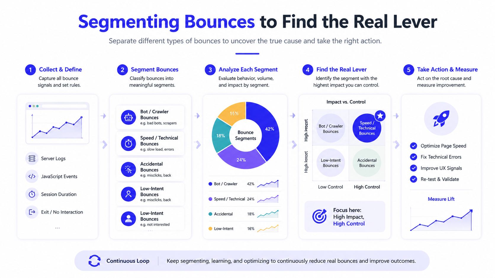
Segmenting Bounces to Find the Real Lever
The fastest way to waste time is to stare at sitewide bounce rate and guess. The useful move is to isolate the 3 to 5 highest-traffic, highest-bounce pages, then slice each one by source, device, and, when useful, country and landing experience. That tells you whether the issue is acquisition mismatch or actual page friction.
Separate the traffic problem from the page problem
If a page bounces hard from paid search but behaves normally from branded organic traffic, the page may not be broken at all. The ad promise may be too broad, the keyword intent may be off, or the landing page may be too generic for the query. On the other hand, if every source on mobile performs badly while desktop holds up, the likely culprit is page experience, not targeting.
That distinction changes prioritization. A source-level problem belongs in campaign structure, ad copy, audience selection, and negative targeting. A device-level problem usually belongs in speed, layout, tap targets, or content hierarchy. Treating both as “bounce rate” leads to random fixes.
What you see | Likely lever |
|---|---|
Paid traffic bounces, organic doesn't | Intent mismatch or audience quality |
Mobile bounces, desktop doesn't | Page experience or performance |
One geography underperforms | Localization or network-related friction |
All traffic underperforms | Page-level issue or tracking issue |
The reason to start with the top pages is simple. A small number of landing pages usually carry a large share of traffic, which means they also carry a large share of the waste. Fixing the wrong page because it “looks bad” is busywork. Fixing the right page because it's the biggest leak is operations.
Fixing the Page Before You Fix the Creative
Speed and rendering problems often suppress engagement before the user even sees the offer. In industry benchmark data collected in 2026, pages loading in under 1 second bounce at 30.8%, while pages taking 3 to 6 seconds bounce at 49.3% and pages over 6 seconds bounce at 67.2%. That gap is too large to ignore, and it makes technical cleanup the first page-level lever to pull. See the benchmark data in this 2026 bounce-rate benchmark report.
What to clean up first
Start with the stuff that blocks the main thread or delays visual completion.
Compress images and use modern formats. Large hero assets slow the first meaningful view more than teams often expect.
Defer nonessential scripts. Analytics tags, widgets, chat tools, and social embeds can wait if they don't support the first interaction.
Trim CSS and prioritize critical styles. If the page can't render above the fold cleanly, the rest of the copy barely matters.
Use caching and a CDN. Static assets should arrive quickly, especially on campaign pages with repeat traffic.
Fix font loading. Invisible or shifting text creates a choppy first impression that kills momentum.
Remove early-loading third-party tags. Every extra vendor adds risk before the page is ready.
The reason creative changes come second is blunt. A slow page with a clearer headline is still a slow page. Better copy helps once the user can read it, but it won't rescue a page that stalls before interaction.
If a page is taking several seconds to become useful, the user is already making a decision before the message is visible.
A clean audit usually shows the same pattern. The page looks fine in a design file, then falls apart under production load because scripts, images, and tags compete for attention. Fixing those bottlenecks usually produces more reliable engagement than rearranging sections or rewriting the hero alone. For a lot of landing pages, that's the difference between a cosmetic tweak and an actual bounce rate reduction.
Filtering Traffic Before You Redesign Pages
Some bounces are supposed to happen. If the click came from the wrong keyword, the wrong audience, or the wrong placement, then “reducing” the bounce may just mean attracting more unqualified sessions. In the post-third-party-cookie era, the better move is often to improve traffic filtering and attribution quality so the page sees fewer bad fits in the first place.
Tighten the upstream inputs
The biggest gains usually come from matching the ad to the landing page more precisely.
Sharpen audience targeting in Google Ads and Meta. Broader audiences create more mismatch, especially when the page is built for a narrow intent.
Add negative keywords and placement exclusions. If the wrong queries or placements keep appearing, remove them instead of asking the page to absorb the waste.
Build intent-matched landing pages. One ad group, one promise, one page beats a generic catchall page for most paid programs.
Feed CRM outcomes back into targeting. If low-fit leads keep converting, use that feedback to suppress them from future campaigns.
Many teams get trapped here. They obsess over a bounce number that includes low-intent traffic, then redesign the page when the core problem is audience quality. Better targeting can raise the share of sessions that matter even if the raw bounce rate barely moves. That's the right trade-off when the goal is revenue, not vanity.
A good audit asks a more uncomfortable question: which traffic sources are cheap, noisy, and expensive to keep? Some sessions are economically efficient to lose. If they were never going to buy, book, or qualify, then filtering them out is the win.

Running CRO Experiments That Bounce Rate Cannot Lie To You About
A/B testing gets silly when bounce rate is the only scoreboard. The better setup is to choose a primary metric before launch, usually engaged-session rate, scroll depth, form start rate, or qualified lead / purchase rate, then let bounce rate act as a secondary diagnostic, not the final verdict. If you need a landing page conversion optimization framework, this guide on landing page conversion optimization is the right companion.
What to test first
The best hypotheses usually come from the segmentation work above, not from random brainstorming.
Message match above the fold. Make the headline mirror the ad, keyword, or promise that brought the visitor in.
CTA clarity. Replace vague language with a verb that matches the visitor's stage.
Social proof placement. Put credibility where doubt appears, not buried below the fold.
Form length. Remove fields that don't improve qualification.
Offer framing. Test whether the user wants a demo, a calculator, a sample, or a direct quote.
Visual hierarchy. If the eye lands on the wrong thing first, the page is fighting itself.
The mistake that kills most tests is stopping when bounce rate “looks better.” A test can lower bounce by attracting curiosity clicks while hurting lead quality, and that's a loss dressed up as progress. Hold the experiment to the metric that maps to revenue.
A disciplined backlog makes this easier. Rank hypotheses by the size of the traffic segment, the severity of the leak, and the effort to implement. Then run one meaningful test at a time so you can learn what caused the change.
Short version: if the page gets more clicks but fewer qualified actions, the test failed.
That mindset keeps CRO from turning into decoration. The page should earn another step only when another step is the right next action. If it doesn't, a lower bounce rate is just noise.
Reporting That Connects Bounce, Engagement, and Revenue
Bounce work becomes credible when leadership can see the chain from session quality to pipeline. A useful monthly report starts with GA4 engagement metrics, pulls in Google Ads and Meta spend, joins HubSpot or Pipedrive opportunity data, and ends with assisted revenue. That's the reporting layer that turns bounce-rate reduction from a cleanup task into a growth lever. For a practical automation build, see marketing reporting automation.
The charts worth keeping
Use three charts and drop the one that causes the most confusion.
Landing page performance by source. This shows whether a page issue or an audience issue is driving the outcome.
Engaged sessions to conversion path. This connects behavior to actual pipeline movement.
Page-level revenue or assisted revenue. This keeps the team focused on value, not vanity.
The chart to drop is the standalone bounce-rate leaderboard with no context. By itself, it encourages bad decisions, especially on pages designed for fast answers or single-step conversion. A page can look ugly in that view and still be profitable.
The reporting habit that matters most is trend comparison. When bounce falls and engaged sessions or revenue rise, the work is probably real. When bounce falls and pipeline stays flat, the page may be attracting the wrong behavior. That's the difference between a metric that looks improved and a system that actually performs.
If you've been fighting bounce rate in a spreadsheet, move the conversation to outcome-linked reporting instead. Leadership will trust the work more when the dashboard shows how the page contributes to revenue, not just how often someone clicked somewhere else.
If you want a bounce-rate reduction program that starts with tracking, filters bad traffic, and fixes the pages that move pipeline, Du Marketing can build the measurement, landing page, and reporting system around it. The work is practical, not decorative, and it's designed to connect engaged sessions to revenue instead of vanity metrics.